App Portal 2013 R2
On the Catalog Appearance subtab of the Web Site tab of the Settings view, you specify the appearance settings of the App Portal website.
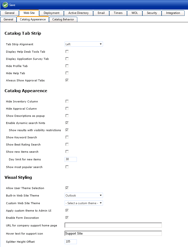
Settings View / Web Site Tab / Catalog Appearance Subtab
The Catalog Appearance subtab of the Web Site tab includes three sets of properties:
| • | Catalog Tab Strip |
| • | Catalog Appearance |
| • | Visual Styling |
The Catalog Tab Strip area of the Catalog Appearance subtab of the Web Site tab includes the following properties:
|
Property |
Description |
|
Tab Strip Alignment |
Determines the alignment of the tabs on the store front. |
|
Enable Help Desk Tools Tab |
Determines whether the Support Tools tab is displayed to members of the Request on Behalf of group. |
|
Display Application Survey Tab |
Select this option to display the App Survey tab, which is where users can identify which applications they want to have redeployed onto a new computer using SCCM OSD. The results of the survey are added to Deployment Management AppSurvey Results, where technicians can review the surveys and apply the selected applications to the new computer. |
|
Hide Profile Tab |
When enabled, the Profile tab will not be visible. This will prevent the user from selecting an alternate approver or specifying a preferred language. |
|
Hide Help Tab |
When enabled, the Help tab will not be visible. |
|
Always Show Approval Tabs |
When enabled, the Approve / Reject tab and the Processed tabs will be visible to everyone, even if they are not an approver. |
The Catalog Appearance area of the Catalog Appearance subtab of the Web Site tab includes the following properties:
|
Property |
Description |
|
Hide Inventory Column |
Select to hide the Inventory column on the Browse Catalog tab. When this column is visible, it displays one of the following icons:
|
|
Hide Approval Column |
Select to the Approval column on the Browse Catalog tab. When this column is visible, it displays one of the following icons:
|
|
Show Descriptions as popup |
If this option is selected, instead of displaying the catalog item description on the Browse Catalog tab below the title, only the title is listed. To view the description in a pop-up dialog box, the user would need to click on the following icon:
|
|
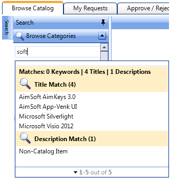
Enable dynamic search hints |
If this option is selected, when entering text in the Search box on the Browse Catalog tab, after you enter the first few characters of a word, a pop-up dialog box will open that lists search results that contain those characters:
|
|
Show results with visibility restrictions |
When App Portal performs a search, it performs an “Intellisense” search on keyword, title, brief description and full description, in that order. However, some catalog items may have visibility rules that filter out what a user can see when they search or browse categories. The thing is the "Intellisense" search does not take into account these rules. Instead we show a lock next to items that have visibility rules, it may show in the search but they may not have access to it. Select this option to hide items from showing in the Intellisense search if there are visibility rules applied. Note: IntelliSense is Microsoft's implementation of autocompletion, best known for its use in the Microsoft Visual Studio integrated development environment. In addition to completing the symbol names the programmer is typing, IntelliSense serves as documentation and disambiguation for variable names, functions and methods using reflection. |
|
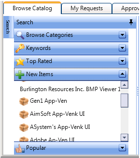
Show Keyword Search Show Best Rating Search Show new items search Show most popular search |
Select these options to enable expanded searching on the Browse Catalog tab by displaying the Keywords, Top Rated, New Items, and Popular search panels.
|
|
Day limit for new items |
If you enable the New Items search panel, specify the number of days that an item would be listed in the New Items search results. |
The Visual Styling area of the Catalog Appearance subtab of the Web Site tab includes the following properties:
|
Property |
Description |
|
Allow User Theme Selection |
Select this option to enable users to select their own personal App Portal website color theme on the Preferences subtab of the Profile tab. |
|
Built-in Web Site Theme |
Choose the default color theme used for new visitors to the App Portal website. |
|
Custom Web Site Theme |
If you have defined a custom web site theme, select it from this list. |
|
Apply custom theme to Admin UI |
If you have selected a Custom Web Site Theme, select this option to apply this custom theme to both the administrative areas of the App Portal web site as well as the user-facing areas. If this option is not selected, and a custom theme is selected, the custom theme will only be applied to the user-facing areas. |
|
Enable Form Decoration |
Use to enable or disable the styling of HTML elements (scrollbars, buttons, and text boxes) to match that of the theme selected. |
|
URL for company support home page |
When specified, an image will appear in the top right of the store front and will link to the URL specified.
|
|
Hover text for support icon |
The text that appears when you hover over the support image when the URL is specified. |
|
Splitter Height Offset |
Specifies the height, in pixels, of the heading area of the App Portal website, which is the area of the website that displays the App Portal logo, the user name and the computer name. If you have customized your App Portal website to use a different logo, as described in Changing the Page Header Logo, you may want to increase or decrease this number. |
App Portal 2013 R2 Configuration GuideDecember 5, 2013 |
Copyright Information | Contact Us |
 Pending Approval
 Approved
 No Approval Required
 License required
 License not available
 License not required