Analyzer Reports
Analyzer is an analysis tool that provides you with a rich Web-based, drag-and-drop user interface, which makes it easy for you to create reports based on exploration of your data.
You can display Analyzer reports in a dashboard. Unlike standard reports which tend to be static or minimally interactive after they are created, Analyzer reports allow you to explore your data dynamically and to drill down into the data to discover previously hidden details. Analyzer reports present data multi-dimensionally and lets you select what dimensions and measures you want to explore. Use Analyzer reports to drill, slice, dice, pivot, filter, chart data and to create calculated fields. Users of Analyzer reports can query the data in a database without having to understand how the database is structured.
The data source used for an Analyzer Report is based on a Mondrian schema (also referred to as an Analysis Model). Mondrian schemas are XML models that have cube-like structures which use fact and dimension tables found in a relational database.
Note:The field view in the sample report below is organized by Category (hierarchies and levels within a dimension). You can organize the field view in your Analyzer report alphabetically (A-Z), by Number (measures) - Text (names, categories, etc.) - Time (months, quarters, and years), and by Schema, which displays the dimensions as defined in the Mondrian schema.
Follow the steps below to start creating the Analyzer report.
| 1. | In the User Console, go to the Reports menu and select Create Analyzer Report. A Select Data Source dialogue box will appear. |
| 2. | Select your Schema and Cube from the list. For the purposes of this exercise, select Normalize: IT Assets. |
Note:A schema is the structure of the relational database and includes tables, fields, views, and more. A cube is a data structure that allows information in a database to be analyzed quickly and from multiple perspectives.
| 3. | In the Available Fields panel on the left, click and drag SW Category to the Rows panel within the Layout panel. |
Software Category Column
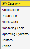
The SW Category column appears in the workspace.
| 4. | In the list of fields, click and drag SW Install Count to the Measures area within the Layout panel |
Software Category and Install Counts
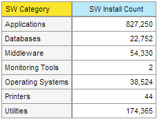
The SW Install Count column appears in the workspace.
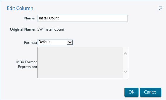
| 5. | Right-click the SW Install Count column, then select Column Name and Format. |
| 6. | In the Name: field, change the column name to Install Count. Click OK. |
Edit Column Screen
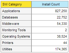
The data auto-updates and displays the new name.
Updated SW & Install Columns
| 7. | Right click on “Install Count” and select “Sort Values High to Low”. |
New Counts Screen
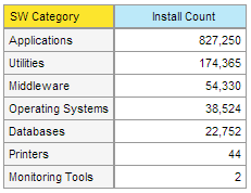
The Install Count column is sorted high-to-low.
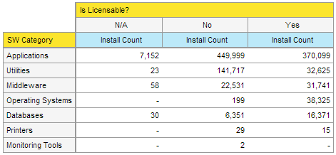
| 8. | Click and drag the “Is Licensable?” column to the Columns panel within the Layout panel. |
Is Licensable Screen
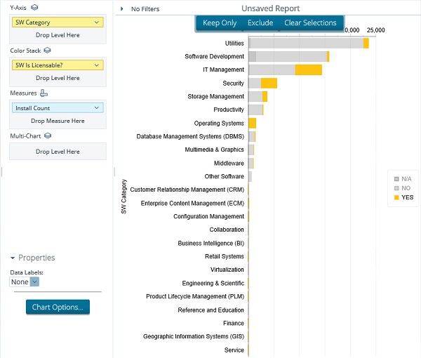
At this point you have a functioning report and you can view your data in chart form. Click Switch to Chart Format to examine your report data in a chart format, located on the top right of the tool bar next View As. The default display is a bar chart but if you click Choose Chart Type you can select a different chart type to display your data.Use the “Layout” pane to re-arrange the rows and columns. For example, leave “SW Category” on the Y-Axis ad move “Is Licensable?” to the Color Stack.
Unsaved Reports
| 9. | Save your report before continuing the exercise. |