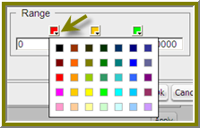
You can change the color of a dial sector by clicking the small down arrow in the color boxes associated with Range. Select a color from the palette so that you can preview it on your dial chart. Click Apply to preview your dial chart. Click OK to place your dial chart into the dashboard.
Dial Selector Color Options
Correcting Scaling Issues
Use the scaling feature in instances where numeric values in a chart are so long that they affect the display.
| 1. | Preview your chart in the Chart Designer. |
| 2. | Under Scale, click to display the drop-down list of scaling options. In the example below, the scaling option used is “1000.” Notice the change in the display of numeric values when scaling is applied. Users of the chart can see actual values when they hover over the bars in the chart. |
Scaling Issue Corrections
| 3. | Click OK to display the chart in the dashboard. |
Note • The scaling feature is available for all chart types except pie.
Rotating Chart Axis Labels
If your chart axis labels become unreadable because they are too long, Label Rotation may correct the problem.
| 1. | In the Chart Designer, display your chart. |
| 2. | Under Label Rotation, select Diagonal or Vertical and click Apply. |
The labels display with the rotation you set.
| 3. | Click OK to display the chart in the dashboard panel. |
Editing a Chart
Follow the instructions below to edit a chart.
| 1. | In the Dashboard Designer, select the panel that is displaying the chart you want to edit. |
| 2. | In the upper right corner of the panel click (Edit) |
The Chart Designer appears.
| 3. | Click Edit Query. |
The Query Editor opens.
| 4. | Edit the query as needed and click OK. |
The Chart Designer appears.
| 5. | Select the appropriate data definitions to build the chart. |
| 6. | If applicable, change the chart type and theme and click Apply to see a preview of the edited chart. |
| 7. | Click OK to display the chart in the dashboard. |
Adding a Data Table to a Dashboard
The Data Table feature allows you to display a tabular representation of a database query in a dashboard. It also allows you and consumers of the dashboard to manipulate the display of the data in the data table, while in the dashboard. For example, users can resize, sort, and change the order of columns. Follow the instructions below to add a data table to your dashboard.
| 1. | Select a panel in the Dashboard Designer. |
| 2. | Click (Insert) and select Data Table. |
The Select a Data Source dialog box appears.
| 3. | Select a data source from the list of available data sources and click OK. |
The Query Editor opens.
| 4. | Begin building your query. Click (+) next to the category name to display its associated table columns. When the column names appear, click to select the column that contains the data you want displayed in your data table. |
| 5. | Click the small yellow arrow to place the column name under Selected Columns. |
| 6. | Now add the Conditions; these are your constraints that filter what you are selecting. You can add multiple conditions. |
Under Combine, you can select your constraint (and, or, and not, or not) from the drop-down list. Under Comparisons you can click the drop-down list to display options for comparisons, =, <, >, and so on; (for example, where the customer number is equal to 144 or 145). You can also select an aggregation type from the drop-down list for table columns that contain numeric data. The table below contains a definition for each aggregate type:
|
Aggregate Type |
Description |
|
SUM |
Sums a column's values |
|
COUNT |
Counts a column's values |
|
AVG |
Averages a column's values |
|
MIN |
Selects the minimum column value |
|
MAX |
Selects the maximum column value |
Note • Click Preview at any time to view the data associated with your query.
| 7. | Add the columns that you want to Order By. The ordering of the selected data is accomplished by one or more columns in a table. For example, you can sort the data by customer name and address. |
| 8. | Click OK in the Query Editor when you are done. |
The Data Table appears in the dashboard panel.
BDNA Data Platform 5.5 User Console Help Library02 August 2016 |
Copyright Information | Flexera |