Bubble Charts
Note:
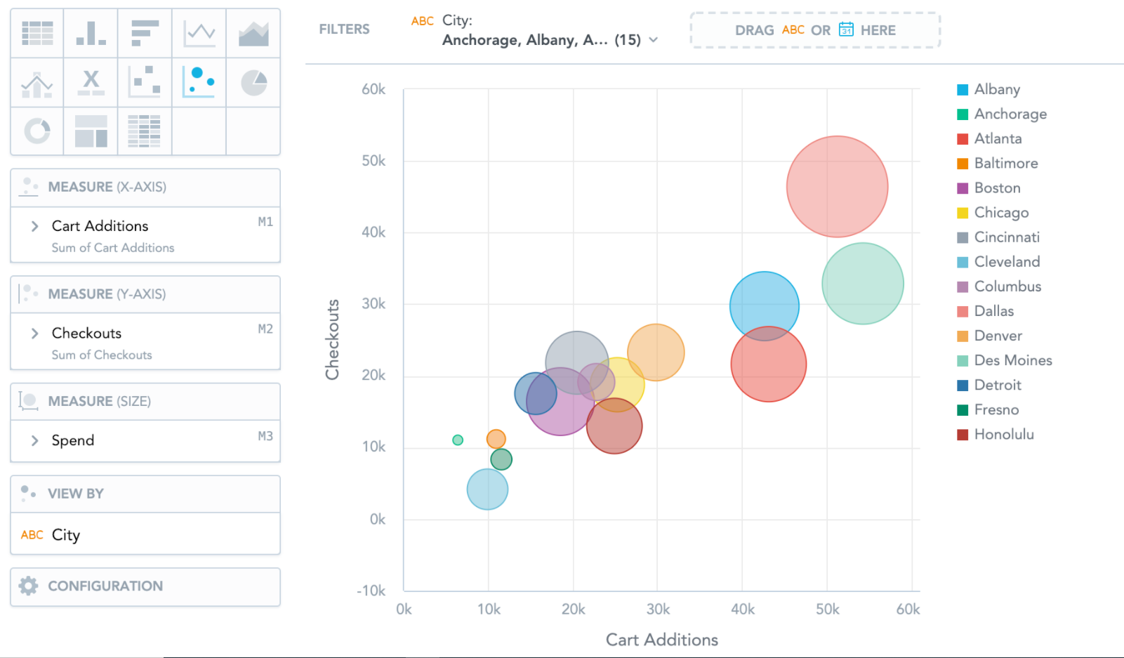
Bubble charts are similar to Scatter plots. They show data points as bubbles using Cartesian coordinates. In addition, bubble charts can display the size of the bubbles in proportions using a third measure. If you add an attribute to the View by section, the bubbles get different colors for each attribute value.
Bubble charts have the following sections: Measure (X-axis), Measure (Y-axis), Measure (Size), View by, and Configuration.