High Water Mark Report
Like the Usage Over Time report, the High Water Mark report produces a line graph that shows the maximum number of licenses used during a selected time period. The same summary periods are available for High Water Mark graphs as for Usage Over Time graphs, but the default summary period for a High Water Mark report is Hour.
Each page of the report displays usage for one feature. The horizontal axis of the line graph is time, scaled to fit all the data for one feature into one window. The vertical axis is number of licenses used; alternatively, this can be configured to show the percentage of available licenses. For each feature, two lines are plotted: one, representing licenses available and the other, representing licenses used.
You can omit the plot of available licenses by clearing the Show Available Licenses option in Step 5 of the Create Report Configuration wizard.
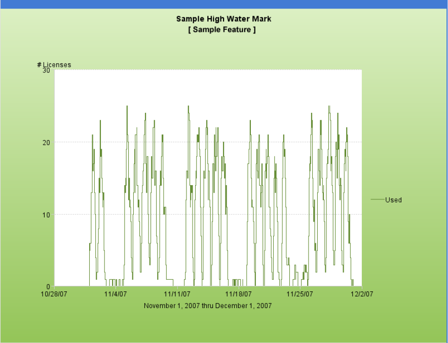
High Water Mark report
High Water Mark graphs are subject to automatic data reduction when data sets are particularly large. If automatic data reduction has occurred, a warning appears in the log for that report (stating that the graph contains too many data points and that the number of points is automatically reduced).
Automatic data reduction applies only to graphical reports and it reduces data density and detail. To avoid automatic data reduction, reduce the number of data points by choosing a different summary period or by narrowing the date range for the report.