Usage Over Time Report
A Usage Over Time report produces a line graph that shows the maximum number of licenses in use over a period of time.
The granularity of the report can be adjusted using the Summary Period menu in Step 5 of the Create Report Configuration wizard. The default summary period of None corresponds to resolution of one second, which is the same resolution found in report logs. Coarser granularities of Minute, Hour, Day, Week, Semi-Month, and Month are also available.
Usage for each feature is displayed on a separate page of the report. The horizontal axis of the line graph is time-scaled to fit all the data for one feature into one window. The vertical axis is number of licenses used; alternatively, this can be configured to show the percentage of available licenses.
For each feature, two lines are plotted: one representing licenses available and one representing licenses used. For features that have low levels of activity compared with the number of licenses available, consider omitting the available license plot from the graph. To do this, clear the Show Available Licenses check box in Step 5 of the Create Report Configuration wizard.
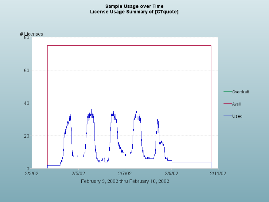
Usage Over Time report
Usage Over Time graphs are subject to automatic data reduction when data sets are particularly large. If automatic data reduction has occurred, a warning appears in the log for that report (stating that the graph contains too many data points and that the number of points is automatically reduced).
Automatic data reduction applies only to graphical reports and it reduces data density and detail. To avoid automatic data reduction, reduce the number of data points by choosing a different summary period or by narrowing the date range for the report.