Corporate Branding Tab
App Portal 2021 R1
On the Corporate Branding tab of the Site Management > Settings > Web Site view, you can customize the colors used in your App Portal site.
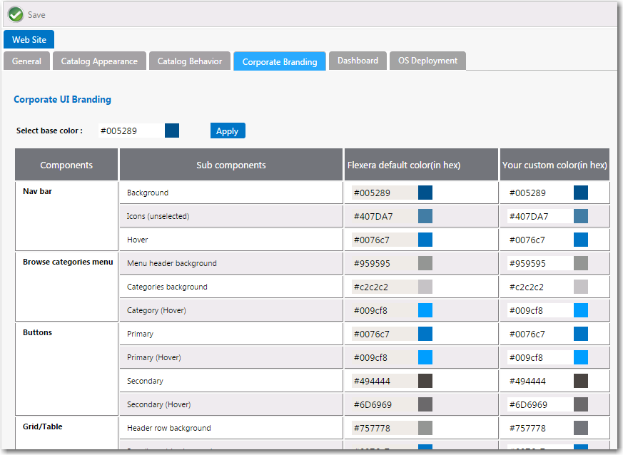
Settings > Web Site > Corporate Branding Tab
By default, App Portal’s user interface is branded with a color theme that mostly consists of various shades of blue and gray. However, you can change the color theme on the Corporate Branding tab of the Site Management > Settings > Web Site view.
Important:If you have modified the CSS files shipped with previous releases of App Portal to customize the colors of the site, those changes will not be retained when you upgrade to App Portal 2015 R2. You will need to perform the steps in Customizing the App Portal User Interface Colors to customize the colors of your App Portal user interface.
There are two methods for changing the App Portal color theme to match your corporate colors:
| • | Changing the Base Color and Automatically Generating Other Colors |
| • | Changing the Individual Component Colors |
Changing the Base Color and Automatically Generating Other Colors
The easiest way to change the App Portal color theme is to simply change the color listed in the Select base color field. App Portal will then automatically generate color codes of various shades of that color that will be used throughout the site.
For example, suppose your company had a green logo with a HEX value of #006600. If you entered #006600 into the Select base color box and then clicked Apply, a preview of the colors that would be applied throughout your site, that are based on the specified base color, will appear in the Your custom color column.
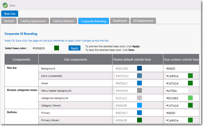
Applying a Base Color With Preview of Colors in Your Custom Color Column
If you are satisfied with the colors listed in the Your custom color, click Save. The browser window will be refreshed and the new color theme will be displayed.
To return to the default Flexera Software colors, click the Reset to default button at the bottom of the Corporate UI Branding tab.
Changing the Individual Component Colors
You have the option of setting the color individually for each of the listed components of the App Portal application. This is a more difficult option because you have to specify slight variations in your corporate color to serve as hover colors and the background colors for drop down menus, etc.
Your first step would be to determine the colors that you want to use for each of the listed App Portal subcomponents.
|
Component |
Sub Components |
Your Custom Color |
|
Nav bar |
Background |
|
|
Icons (unselected) |
|
|
|
Hover |
|
|
|
Browse categories menu |
Menu header background |
|
|
Categories background |
|
|
|
Category (hover) |
|
|
|
Buttons |
Primary |
|
|
Primary (hover) |
|
|
|
Secondary |
|
|
|
Secondary (hover) |
|
|
|
Grid/Table |
Header row background |
|
|
Row (hover) background |
|
|
|
Row (alternate) background |
|
|
|
View and dialog box tabs |
Tabs (selected) |
|
|
Background |
|
|
|
Highlight color |
Search box button, Top border, Progress wheel |
|
|
Pop up dialog box |
Background |
|
|
Others |
View titles/subtitles |
|
|
Hyperlink |
|
|
|
Background of summary box on Checkout page (in progress) |
|
|
|
Welcome menu hover |
|
|
|
Dropdown menu hover |
|
|
|
Admin tab navigation menu hover |
|
|
|
Image button hover |
|
In the Your custom color column, you would enter the the colors you have selected and click Save. The browser window would then be refreshed and the new colors you specified will be displayed throughout the App Portal site.
To return to the default Flexera Software colors, you can click the Reset to default button at the bottom of the Corporate UI Branding tab.