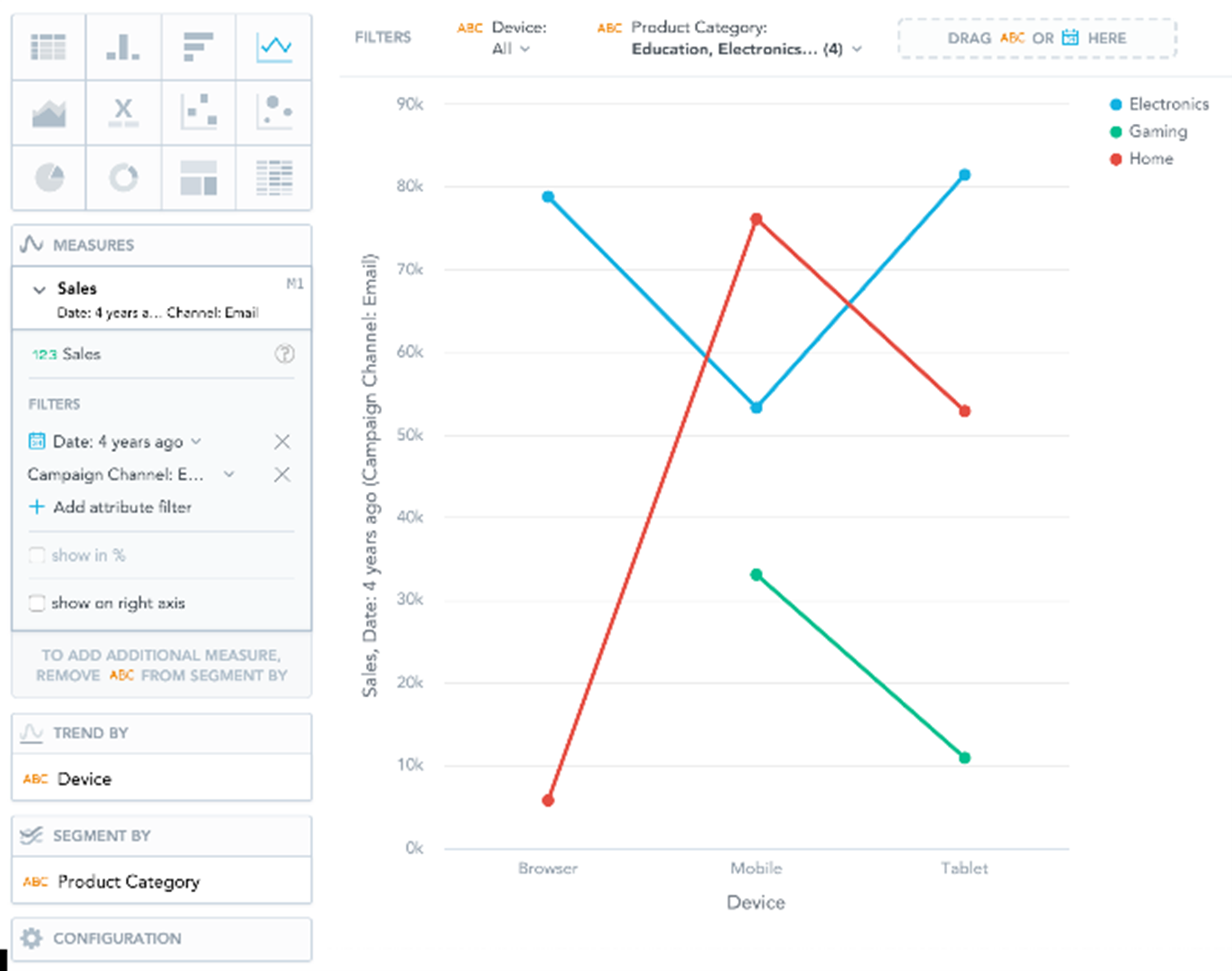
Line Charts
Note:
Line charts can display changes in measures across time or progress across a series of stages.
Line charts have the following sections: Measures, Trend by, Segment by, and Configuration.
If you configure the Trend by section and add Date or Attribute, you display a trend line. Trend lines connect individual measure/attribute values.
In line charts, you can also:
| • | Display the values as a percentage. You must add Dates or Attributes to the Trend by section. |
| • | Display individual values of an attribute. Add an attribute to the Segment by section and must have only a single item in the Measures section. |
| • | Compare your data to previous period or same period of the previous year. For details, see Time Over Time Comparison. |
| • | Slice your data by Date or Attribute. You must add Date or an Attribute to the View by section. |
| • | Display a secondary y-axis on the right side. You must select the show on right axis checkbox in the measure settings. |
For information about common characteristics and settings of all insights, see Insight Types.