Bar Charts
Note:
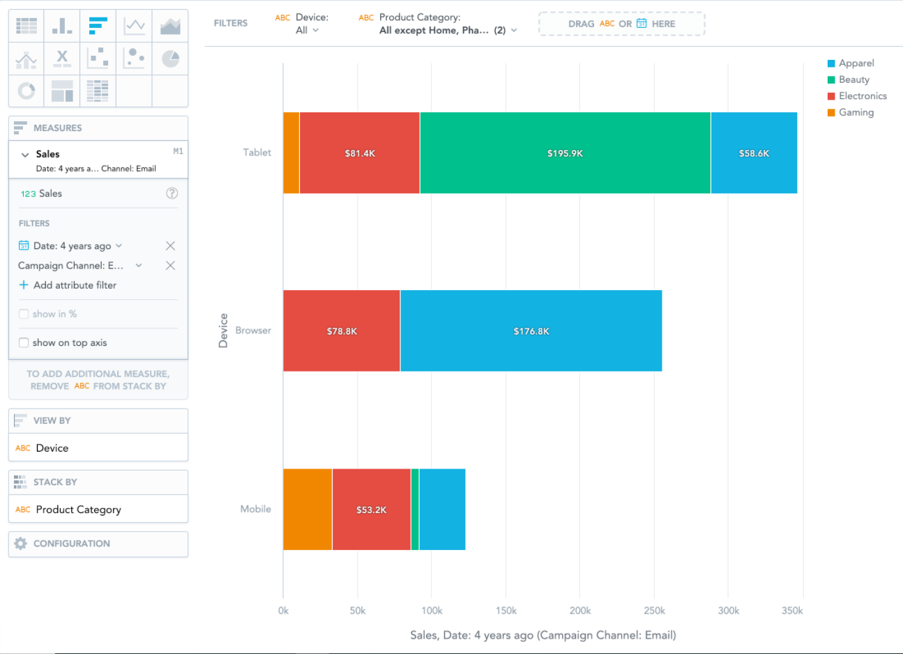
Bar charts show your data in horizontal bars.
Bar charts have the following sections: Measures, View by, Stack by, and Configuration.
In bar charts, you can also:
| • | Display the values as a percentage. You must add Dates or Attributes to the View by section. |
| • | Stack the chart by attribute or date. To add an attribute or date to the Stack by section, you must have only a single item in the Measures section. If you have multiple measures in the Measures section, you can stack the measures. For details, see Stack Measures. |
| • | Compare your data to previous period or same period of the previous year. For details, see Time Over Time Comparison. |
| • | Slice your data by up to two dates or attributes. Add the dates or attributes to the View by section. If you add two dates in the View by section, they must have the same date dimension (the Date as option). If you change the date dimension of one date attribute, Data Explorer changes the date dimension of the second date attribute automatically. The Group by option can have different values. |
| • | Display a secondary x-axis at the top. You must select the show on top axis checkbox in a measure settings. |
If a bar chart is sliced by an attribute, the data is sorted by its value. If a bar chart is stacked, it is sorted by the total value of the bars.