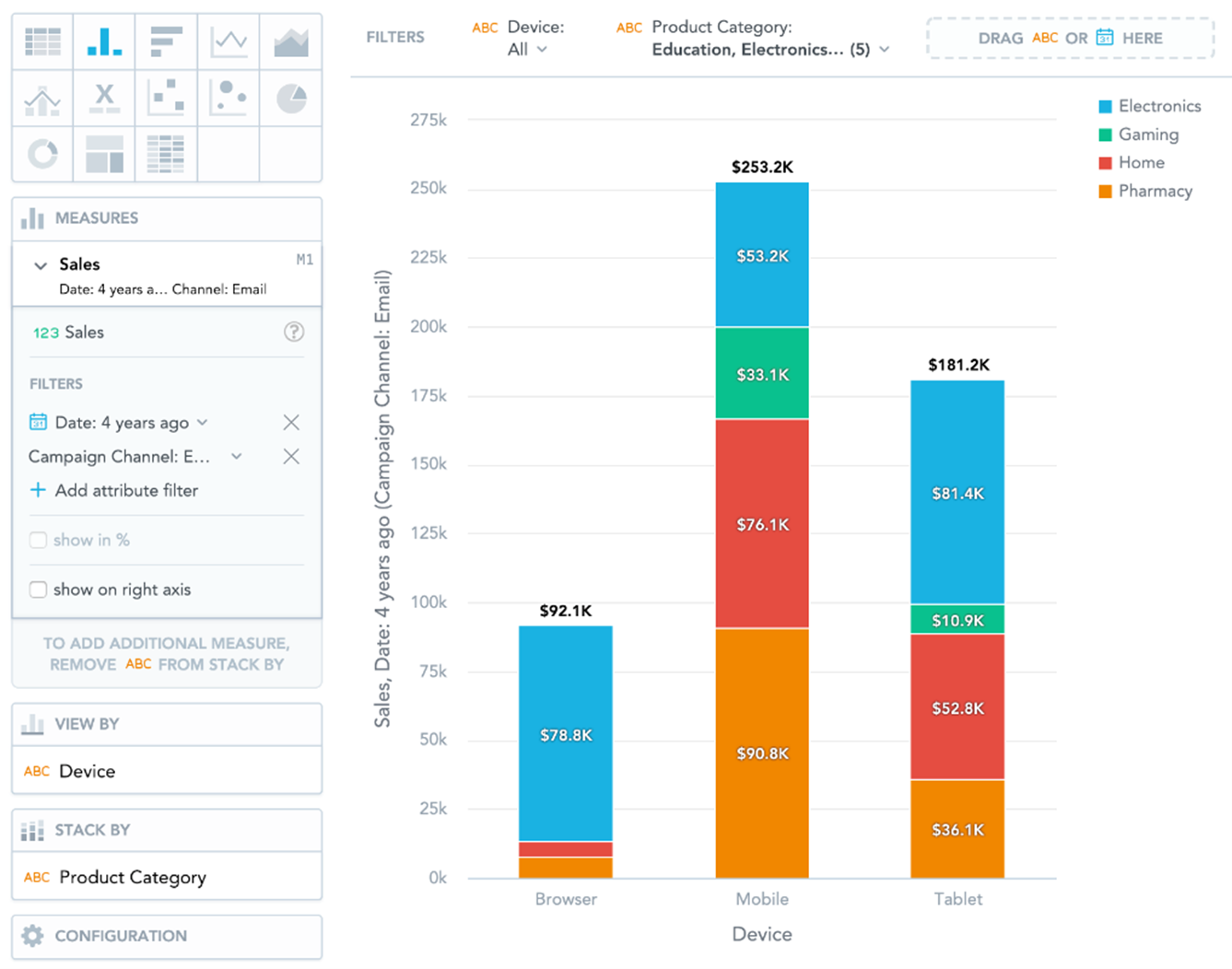
Column Charts
Note:
IT Visibility is being upgraded with the introduction of Technology Intelligence Platform beginning in September 2024. Flexera will contact you directly regarding the timeframe of your upgrade. With Technology Intelligence Platform, out-of-the-box IT Visibility dashboards are being replaced with new, enhanced IT Visibility Technology Intelligence Platform reports. For more information, see IT Visibility With Technology Intelligence Platform Reports.
By default, when you add measures or attributes to an insight, they are displayed in a column chart.
Column charts have the following sections: Measures, View by, Stack by, and Configuration.
In column charts, you can also:
|
•
|
Display the values as a percentage. You must add Dates or Attributes to the View by section. |
|
•
|
Stack the chart by attributes. To add an attributes or date to the Stack by section, you must have only a single item in the Measures section. |
|
•
|
If you have multiple measures in the Measures section, you can stack the measures. For details, see Stack Measures. |
|
•
|
Slice your data by up to two dates or attributes. Add the dates or attributes to the View by section. If you add two dates in the View by section, they must have the same date dimension (the Date as option). If you change the date dimension of one date attribute, Data Explorer changes the date dimension of the second date attribute automatically. The Group by option can have different values. |
|
•
|
Display a secondary y-axis on the right side. You must select the show on right axis checkbox in a measure settings. |